Independent art director and designer for brand and web
Independent art director and designer for brand and web
Brackley Bay Oyster Co.
Visual identity for Brackley Bay Oyster Co. — the PEI oyster company fishing on nearly 100 years of legacy.
Brackley Bay Oyster Company holds one of the oldest recorded oyster leases on Prince Edward Island, dating back to 1922. Today their wild-caught oysters are in high demand as the company continues to grow.
We developed a visual identity that celebrates this strong connection to place, and offers a fresh take on heritage.
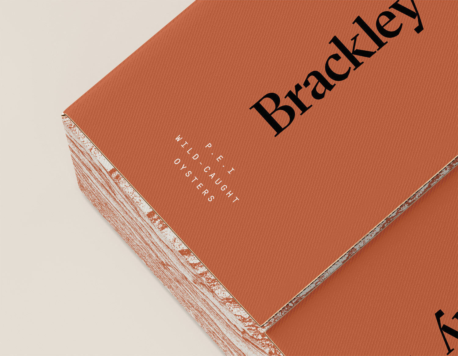
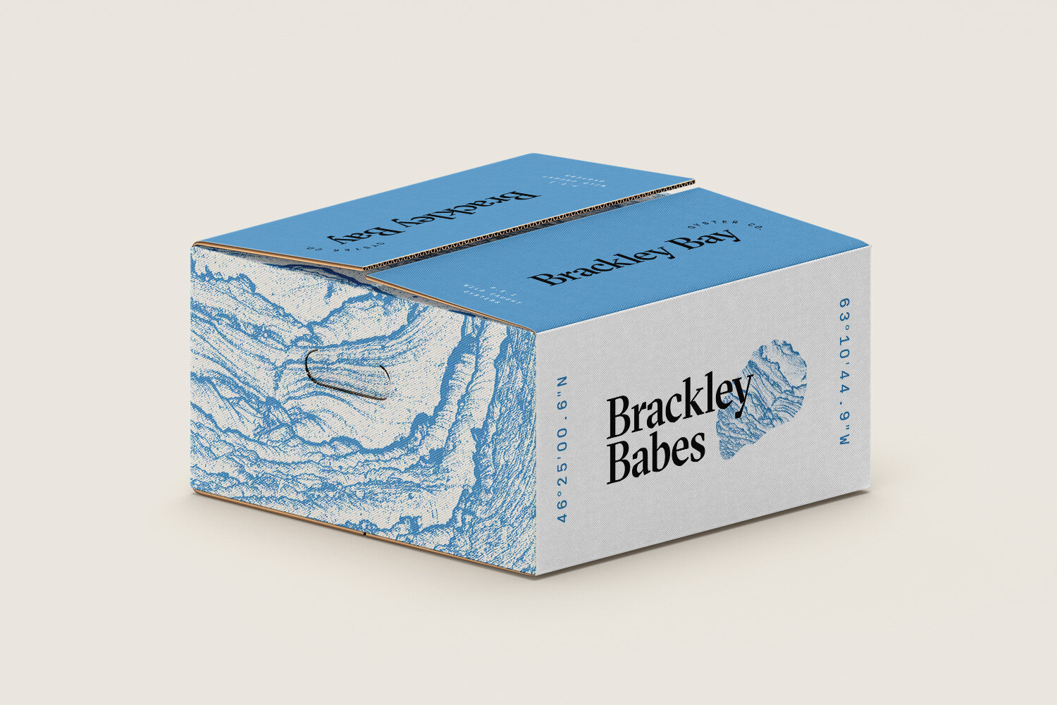
Role Creative Direction Visual Identity Logo Stationary Packaging
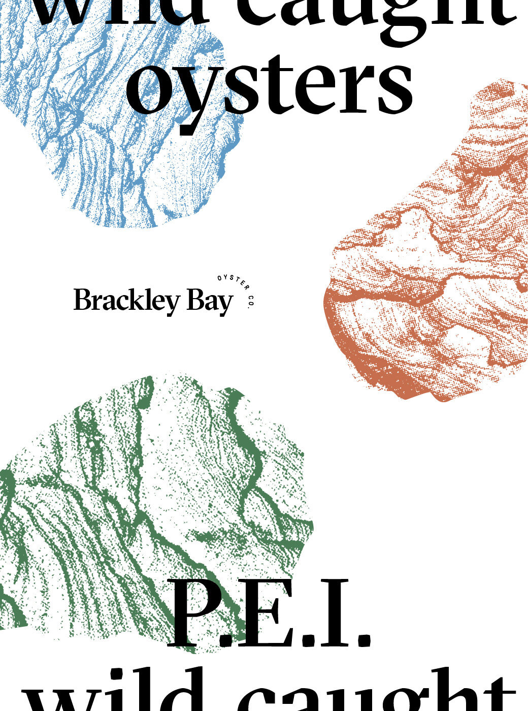
The wordmark’s angular typography invokes the coarse shape of an oyster shell. It’s paired with a modern, monospaced secondary font for typographic details.
The brand’s colour palette draws inspiration from PEI’s landscape — distinctive red sand, blue sky and green fields.
A textural pattern is also utilized throughout the visual identity, reminiscent of shore lines and the layered texture of an oyster shell.